"Prost!" was completed in 2017 as the result of a 10 year effort. I started collecting bottle caps for two reasons:
1. Each was a tiny memento of the good times shared with friends and family.
2. Bottle caps are an interesting medium: little canvases of necessity, destined for the trash.
2. Bottle caps are an interesting medium: little canvases of necessity, destined for the trash.
The fate of the bottle cap was at odds with the value of the experience it represented and I wanted to give the collection a more permanent display, worthy of such important tokens.
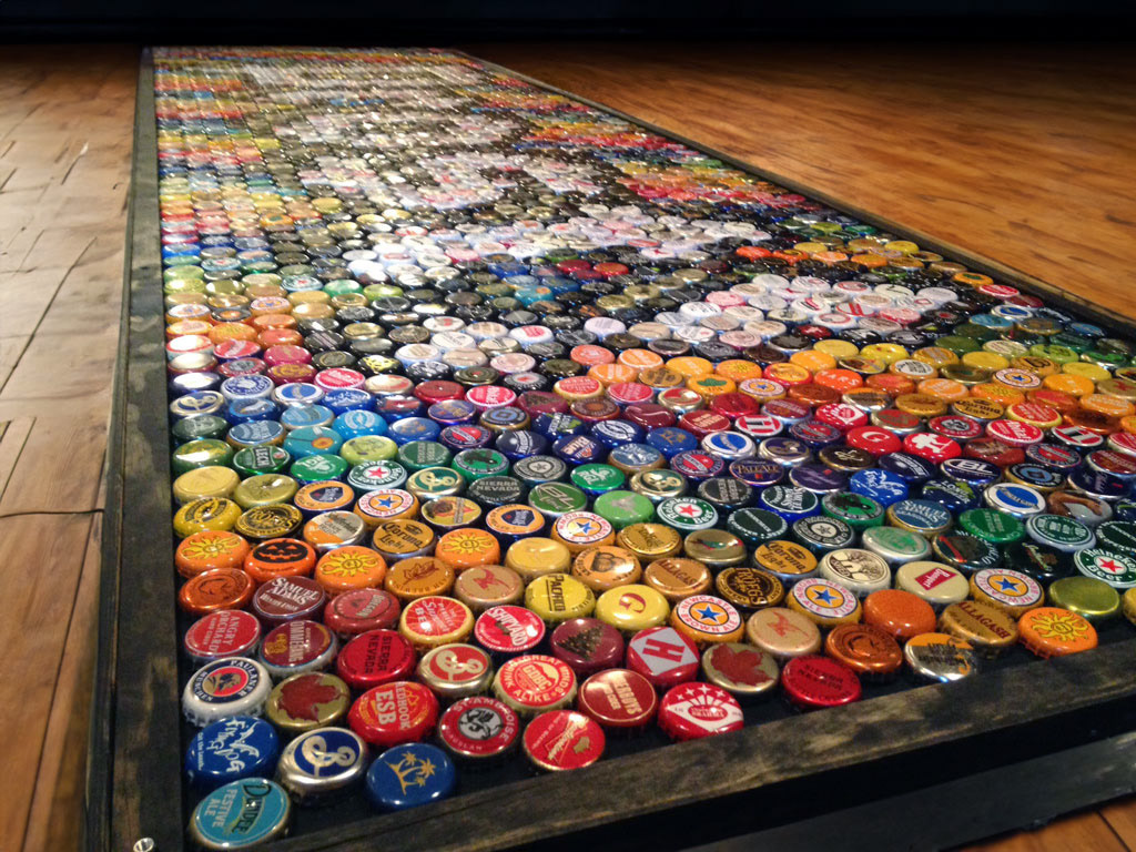
I settled on the idea of a beer games table top as a way to give them good visibility, ongoing utility, and thematic continuity. And it was college. This provided the initial constraint for the general size and shape of the piece.
It was challenging to select an enduring design that would also tie together all the experiences that made its creation possible. A randomized mosaic was considered, but felt too arbitrary and the examples I had seen using that technique lacked aesthetic value. I had strong leanings toward something geometric, but felt that a pattern alone didn't quite match the spirit of the piece.
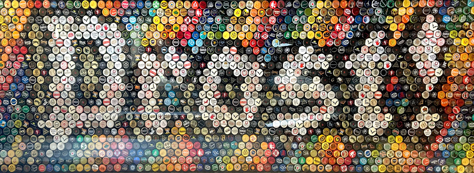
Eventually I settled on "Prost!", the German word for "Cheers!", as a timeless message of camaraderie that paid homage to the history of beer itself and to my German-loving friend/mentor/drinking buddy with whom the collection had first started.
A gothic font was selected for general visual appeal, thematic continuity with the language, and because I felt the lightly geometric characters would work well with the bottle cap alignment.
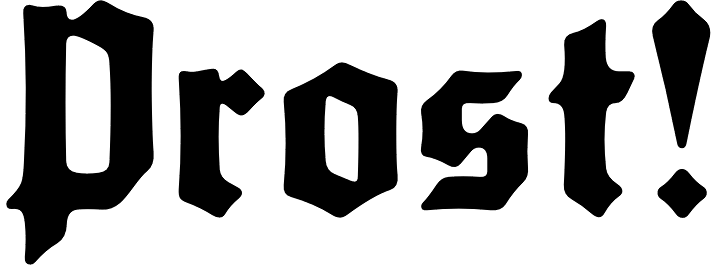
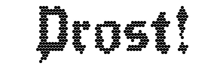
The "Prost!" text used to create the cap design.
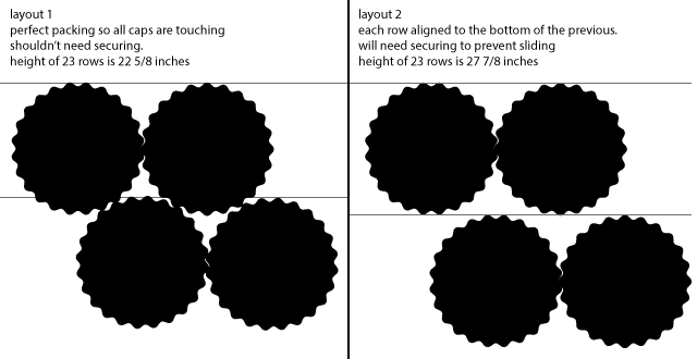
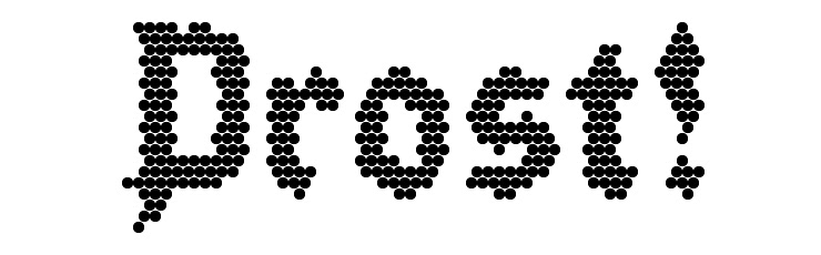
Different cap alignments were mocked up and considered.
Layout 1 was selected as the best option.
Layout 1 was selected as the best option.
The "Prost!" text was overlaid on the cap grid to create an approximate fill for the text. The initial result was quite good, needing only minimal tweaking to preserve the symmetry and a uniform character height.
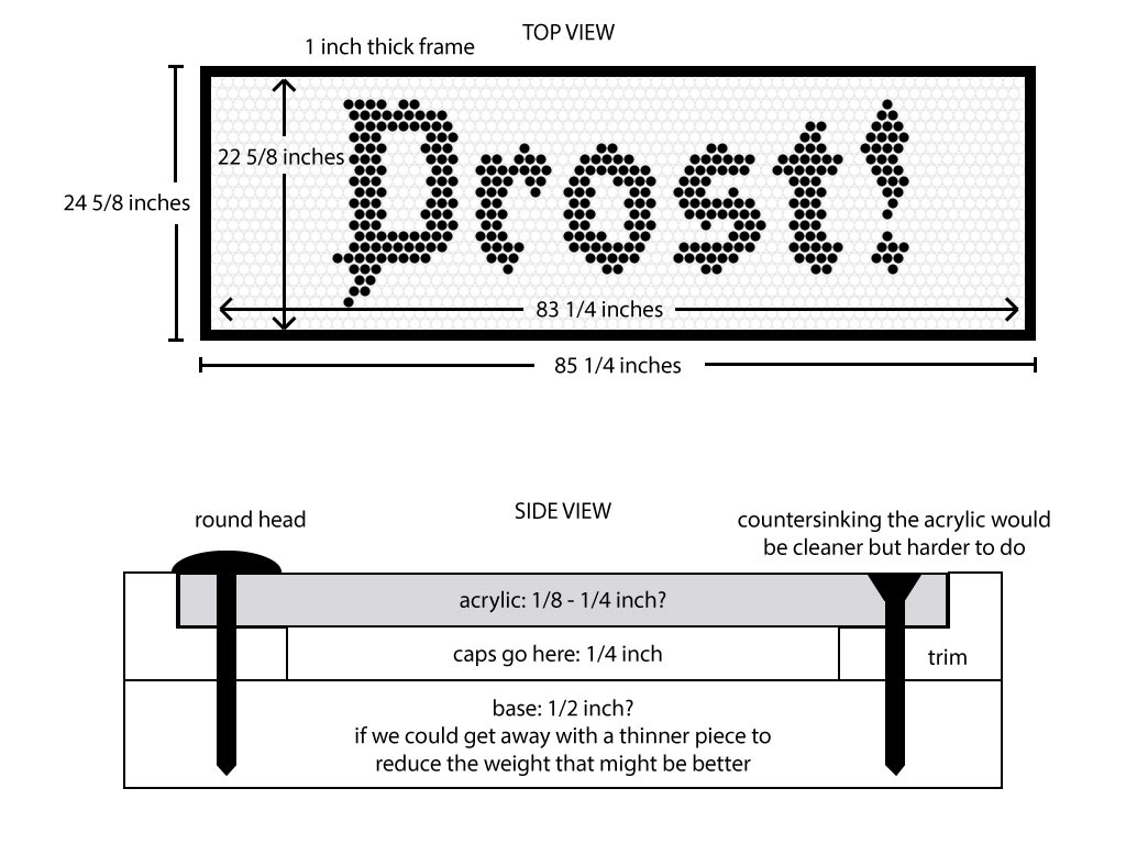
The frame was constructed using a plywood base, pine trim, and a thin acrylic layer and is designed to secure the caps within a perfectly packed area without the need for adhesive.
Color tests quickly revealed that legibility was best with uniformly colored text and an outline. Some cap colors were more common than others and the need for high contrast led to the selection of white text with black outline.
The rainbow gradient background was chosen to make the most of the collections' variety, increase contrast with the text, and embody the message of universal friendship.
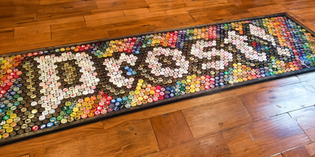
The 3-d effect was a last minute addition. I tested it on the "P" and was pleasantly surprised at how great it looked.
It increased legibility by reducing noise in the letter's interior and the added depth really made the text pop.